
You only get one chance at a first impression.
Many business leaders make the mistake of thinking that once customers have started using your service, they’re hooked. Your job is done.
That couldn’t be further from the truth.
The post-sales onboarding experience is a critical moment in the customer journey. In reality, you face a very high risk of losing that customer if their first experiences with your service are poor.
To mitigate that risk, you must create the best onboarding experiences you can.
And it’s not just critical for new users. Designing a great customer onboarding experience is essential to effective change management.
Users don’t typically like change, and if you’re making major changes to your UI or you’re adding new features to your service, you need to make sure your existing users aren’t driven away by those changes.
In this article, we’re going over everything you need to know to create an onboarding experience that sets your users off on the right foot and makes learning your product or service genuinely enjoyable.
We’re covering the basics of onboarding and practical tips for designing your own onboarding process, and we’re going to look at 9 of the best onboarding experiences on the market.
The industry-leading businesses behind these case studies are an excellent resource to teach and inspire you.
Onboarding 101: A brief introduction

Onboarding is introducing a user to your product or service and helping them learn how to use it.
It’s about ensuring they have the best possible experience with your service, from their first login to becoming an experienced user.
Good onboarding experiences are tailored towards the individual user and should guide them through their journey with your service.
The main aims of onboarding are to ensure your users understand your value and how to use your product or service.
In short, it’s about ensuring customers can get up and running quickly and efficiently— saving both time and resources.
Why is onboarding so important in 2023?

A lot has changed in the last few years, but we want to look at one change in particular: the rise of The Modern Consumer
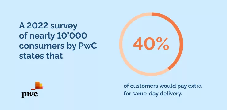
The modern consumer is tech-savvy and values convenience. A 2022 survey of nearly 10’000 consumers by PwC states that 40% of customers would pay extra for same-day delivery.
They expect a seamless, fast, and secure digital experience whenever possible— and they know the onboarding process is supposed to be just that.
In a Business-to-Consumer (B2C) setting, a poor onboarding experience will lead potential customers to abandon your product or service before they ever give it a chance.
An excellent onboarding experience is the minimum modern consumers expect from you.
For example, let’s look at how changing consumer expectations have impacted onboarding in the banking industry.
When a customer opens a new account, there are two specific processes called ‘Know-your-customer due diligence’ and ‘account opening’, which, according to a 2022 survey by Mckinsey, take up nearly half of the onboarding time.
The same survey found that in response, 60% of banks are already offering or looking to offer instant account opening.
Most banks realized that to remain competitive, they must invest in a quick, convenient, and frictionless onboarding experience.
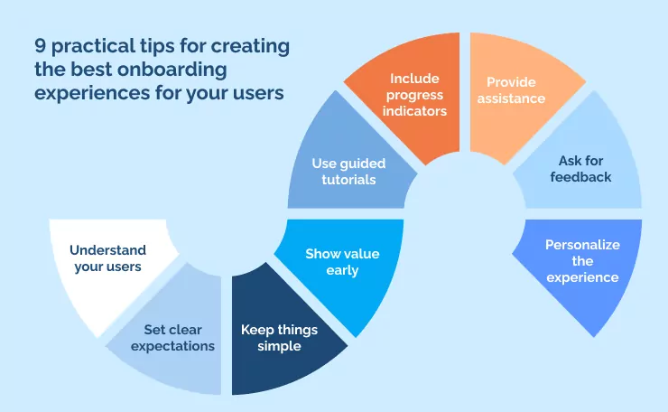
9 practical tips for creating the best onboarding experiences for your users
Every product and every service is unique.
What you have to offer, your unique selling point, and what you do better than the competition— all will differ from business to business.
As a result, there’s no one-size-fits-all approach to creating the best onboarding experiences.
But when you look at the best onboarding experiences out there, as we have, you begin to notice patterns.
Here’s a list of 9 things you should do to create the best onboarding experiences:
- Understand your users
The best onboarding experiences cater to your user’s unique needs and preferences.
It’s important to understand who your customers are, what they want, and how they like to engage with services.
Developing user personas requires a data-driven approach, but it’s a powerful tool for optimizing user experience.
- Set clear expectations
Ensure you clearly communicate what a customer can expect from your service or product so they know exactly what they’re signing up for.
You can even get away with a sub-optimal onboarding experience if you set clear expectations from the beginning.
Users will forgive a lot if they know what to expect.
- Keep things simple
Complex onboarding processes will put customers off.
Use progressive disclosure to give users the information they need when they need it most and gradually give them more as their confidence grows.
Having a simple UI that doesn’t intimidate new users is also beneficial.
- Show value early
Show customers why your service is valuable right away.
Use choice copywriting and highlight select features to demonstrate that your product or service is worth their time and money.
Emphasize the parts of your service that address your customers’ biggest pain points.
- Use guided tutorials
Guided tours are a great way to introduce users to your product or service step-by-step.
Some businesses use video tutorials to supplement the user experience. Others use in-app guidance.
Videos are easier to create, and they work just fine. But in-app tutorials tend to be more intuitive for users.
- Include progress indicators
This might come under the umbrella of setting clear expectations, but it’s important enough to deserve its own point on this list.
Provide customers with tangible progress metrics that show them how far along in the process they are.
This is a small but very common way to gamify the onboarding process, giving users encouragement and motivation to continue.
- Provide assistance
Prioritize customer support at key points during onboarding to quickly resolve any issues without delays or frustrations.
But make sure not to be overbearing. A chatbot popping up on-screen to ask if you need assistance can be a negative experience and disrupt the flow.
Just make sure your customers know what to do if they need help, and they get the help they need if they do ask.
- Ask for feedback
Customer expectations are constantly evolving, so your onboarding process should too.
Collect feedback and data about the onboarding experience from customers who have recently gone through it.
If possible, collect feedback from users who don’t make it through the onboarding process so you know where you can improve.
Also, remember to collect qualitative data like thoughts and feelings and quantitative data like usage statistics. Both are important in creating the best onboarding experiences.
- Personalize the experience
The modern consumer wants a personalized experience.
Personalizing the onboarding process for each user helps to create a more meaningful connection between the customer and your service. It also improves customer loyalty and retention.
You could take personalization a step further by first showing users what they are most interested in.
9 examples of the best onboarding experiences (and why they’re so good)
[For each of these, it would be good to have some images/screenshots of the software’s onboarding process]
Practical tips aside, looking at some of the biggest software companies on the market as case studies for creating the best onboarding experiences can be useful.
We’re going to take a look at:
- Duolingo
- Slack
- Tumblr
- Reclaim
- IBM’s Cognos Analytics
- Toggle
- Grammarly
- Tiktok
- Avo
These titans of industry make excellent use of the strategies we’ve talked about.
Let’s dive deeper into what they do, how they do it, and why it’s worth studying closely if you want to create excellent onboarding experiences for your own users.
1. Duolingo: Immediately shows value
Duolingo has an exceptional user onboarding experience that uses gradual engagement and deferred account creation to create a smooth experience for the user.
Rather than immediately asking users to create an account, Duolingo’s onboarding process starts by guiding visitors through a quick translation exercise to show how quickly and easily learning a new language is.
Users are only asked to sign up after experiencing the app’s core value proposition.
This gives users a sense of accomplishment and helps build momentum to continue progressing.
As a result, registering and creating an account feels like a small step within a larger process instead of being a frustrating obstacle to achieving value.
2. Slack: Makes complex features simple with progressive disclosure
Slack offers an onboarding experience that manages to be informative while also engaging.
The signup process is simple yet welcoming, with a fun message that reads, “Tada!”
Once signed up, new users can explore the various channels and messaging features with the help of well-designed empty states, informational tooltips, and Slackbot, the app’s friendly mascot.
Slack’s onboarding experience has been refined over time, resulting in a minimal and contextual approach that quickly gets users up to speed.
The signup images adjust to reflect a user’s input, providing a more personalized experience. And Slackbot hosts an interactive product walkthrough, encouraging users to act while learning how to use Slack.
Rather than overwhelming new users with every feature, Slack introduces new functions individually through informative microcopy on its empty states.
3. Tumblr: Personalizes every onboarding experience
Tumblr‘s user onboarding process is a great example of how creativity and personalization can improve user experience.
Using a persona-based approach, Tumblr tailors the onboarding process with visual design and microcopy that aligns with each unique user’s interests. This creates a sense of ownership and value for the user.
The signup page showcases user content while explaining the platform clearly and cleverly, setting user expectations from the start.
After creating login credentials, users are prompted to select five or more interests, allowing Tumblr to personalize their feed while further establishing a sense of ownership.
Through a guided walkthrough, Tumblr ensures users know how to navigate the platform’s important features, including engaging with and sharing content.
This not only helps users reach their ‘aha moment,’ but also strengthens Tumblr’s network effects as more users join and engage with the platform.
4. Reclaim: Educates users without adding to their plate
Unlike other calendar apps that only allow you to add meetings and block off time, Reclaim encourages users to reimagine what a smart calendar can do for their lives.
Its onboarding process is designed to introduce users to all of its features in an informative and friendly manner.
When using Reclaim, users can easily set flexible time blocks for other things besides work meetings, such as exercise, reading, or even an afternoon nap.
Reclaim’s onboarding teaches users to consider incorporating hobbies and personal time into their daily and weekly schedules.
Throughout the onboarding experience, Reclaim reinforces these lessons. The app will actively ask if you want to set aside time for lunch and suggest time slots around your scheduled meetings.
Reclaim’s onboarding also highlights that adding habits won’t impact already-booked or future obligations, and users can easily adjust their calendar blocks later.
Reclaim’s visual approach to explaining how its assistant works gives users a clear understanding of how new commitments can be accommodated without any extra work.
This value proposition keeps more people using Reclaim for longer, and its integration with Google Calendar makes uploading and adjusting your schedule easy.
5. Toggl: a “learn-at-your-own-pace” approach makes learning fun
Toggl‘s product onboarding tour is a standout example of how to create a captivating learning experience.
Rather than overwhelming the user with too much information at once, Toggl divides its tour into natural stopping points, allowing users to properly digest the content.
The user is given control, made aware of what they will learn, and given the freedom to manage their own onboarding. The tooltips are well-designed, easy to read, and use on-brand colors.
The interactive sequence allows users to try out a function immediately after being shown how to use it, making it easier to remember.
With Toggl’s onboarding, users feel empowered and in control of their learning experience.
6. Grammarly: Cuts straight to being useful
Grammarly does an excellent job of encouraging discovery through its learn-by-doing demo document within a controlled environment that introduces users to one UI pattern at a time.
You get to learn how to use its features as you use the tool.
Pulsing hotspots that get pointed out for notable features are just subtle enough to avoid obscuring the interface yet eye-catching enough to make users engage.
Once a hotspot is clicked, a tooltip reveals short explanations of the highlighted feature.
The onboarding systematically guides users through the app. After correcting the first line’s spelling error, you’re instantly drawn to the “Correct with Assistant” button, which reveals a feature you may not have explored otherwise.
7. TikTok: A more personalized experience over time
For good reason, TikTok has climbed to the top of the social media ranks. The secret to its success is through its smart onboarding process.
TikTok provides new users with clear instructions on how to improve their experience with the in-app features.
By simply watching videos, liking them, or commenting on them, TikTok’s algorithm catches on to your preferences and provides more content that matches your interests.
But unlike other social media platforms, TikTok explicitly explains to users how to interact with the algorithm to create their own exceptional time on the platform.
TikTok’s onboarding is so easy that it happens while the user is actually experiencing the content that drew them to the app in the first place. The user feels they have control over the process and aren’t being dominated by a machine.
TikTok also defers the signup process until the user has had the opportunity to experience the app’s features.
This way, users can decide if they want to sign up, and TikTok can have more time to convince them to become members.
8. Avo: Puts off sign-up to allay friction
Avo has nailed the art of account sign-up, making it as smooth as possible for new users.
Sign-up is usually tedious, so Avo has designed its onboarding process to be simple, friendly, and informative.
The first thing you notice about Avo’s onboarding process is the simplicity of its design. Each question is on its own page, making it easy for users to spread out their options.
Avo also showcases its expertise by asking knowledgeable questions that get to the root of the user’s needs.
Avo’s copy style maintains a straightforward and informative approach. Instead of using jargon or complicated language that could make onboarding feel like a chore, Avo makes questions easier to answer and more approachable.
Furthermore, Avo reassures users at every step that they can change their answers later, lowering the pressure and allowing users to defer signup without issue.
From the start, Avo’s approachable and user-friendly onboarding process conveys that the tool is easy to use and proficient.
Seal the deal with an effortless onboarding experience

Once you’ve got a customer to get started with your service, you stand a good chance of securing their business.
But if you want to optimize that chance, you’ve got to invest in delivering the best onboarding experiences possible.
The smoother you transition from “new customer” to “experienced user,” the more likely you will win repeat custom.
Crafting those winning onboarding experiences takes empathy and a customer-centric mindset. It also takes a lot of experimentation and reiteration.
But if you invest the time and the work, you could see yourself closing more sales outside of business hours.
WalkMe Team
WalkMe spearheaded the Digital Adoption Platform (DAP) for associations to use the maximum capacity of their advanced resources. Utilizing man-made consciousness, AI, and context-oriented direction, WalkMe adds a powerful UI layer to raise the computerized proficiency, everything being equal.


