
A management dashboard is a useful tool that is used to showcase essential data and metrics such as KPIs. C-level executives also benefit widely from the use of management dashboards because they empower data-driven decision-making and enable judgments to be made based on the latest and most up-to-date information.
An Introduction To Management Dashboards
Management dashboards and project dashboards are essential tools that enhance the strategic decision-making process. These often complex processes help project managers collate vast amounts of data and turn it into useful and actionable insights.
This is achieved through innovative reporting software that enables C-level executives, project managers, and CEOs to gain enhanced visibility of organization-wide performance metrics with up-to-date, real-time data.
This information, in turn, allows managers and higher-ups to establish enhanced visibility across the entire organization while developing and identifying new business opportunities. It also allows businesses, in general, to understand what KPI-based improvements are needed and generate more revenue growth as a direct result.
The Importance Of Project Dashboards
The projects an organization partakes in are the beating heart of successful business operations. Initiatives that are strategic and focus on specific business areas are fundamental to the overall success, growth, and progression of the challenges that modern enterprises face.
When businesses enforce practical management reports, they are able to garner a compelling, data-driven approach to making fundamental business decisions that ultimately guide success.
That being said, only 58% of businesses understand the full potential of project management and the benefits that come with it. When collaborative strategies are successfully implemented and delivered, it becomes a lot easier to manage projects, analyze complex data, and take effective control of your entire team.
For example, important data such as customer acquisition costs (CAC) enable businesses to measure the real-time monitoring of profits and return on investment (ROI). Customer acquisition cost data includes distribution expenses, costs associated with web development, sales, and marketing department salaries, social media, and advertising costs.
This sort of financial data enables businesses to gain a competitive edge and boost project success with little added expenditure.
Online data visualization is the best approach to handling whatever strategic objectives and KPIs you have in place to build your organizational goals.
Utilizing a project management dashboard will enable your organization to become more coordinated, competent, cohesive, and fruitful. In a nutshell, management dashboards are innovative, modern solutions that enable proper performance management throughout your entire cross-departmental organization.
What Are Project Management Dashboards?
The clearest definition of a project management dashboard is a tool that offers a 360-degree overview of the status of a project, insights, and data points. It collates data cross-departmentally and brings together project touchpoints, and integrates them into a single interface.
A management dashboard is an extremely useful tool for project managers and associated teams who can acquire all of the information they need with ease.
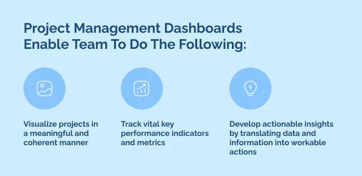
Project Management Dashboards Enable Team To Do The Following:
- Visualize projects in a meaningful and coherent manner
- Track vital key performance indicators and metrics
- Develop actionable insights by translating data and information into workable actions
To put it simply, project dashboards are essential monitoring tools that enable teams to track and manage what’s working for them, what isn’t, and the necessary adjustments needed in order to achieve targets and goals.
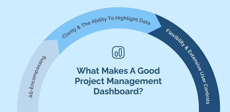
What Makes A Good Project Management Dashboard?
A management dashboard is designed to help make good business performance conclusions and judgments by enabling data-driven decisions. It brings together essential data, reduces a team’s workload, and increases customer lifetime value.
In this section, we will show you how a strategic dashboard can help you achieve target revenue and give your executive team clear insights into cross-departmental functionality. Keep reading to find out what makes a good project dashboard:
All-Encompassing
As we already know, the most critical aim of a project dashboard is to accumulate data from multiple data points and project reports by casting information into one intuitive, easy-to-use interface. Teams need to be able to find value in whichever project dashboard they are using and be able to easily extract information essential to the success of their project.
A project dashboard must encompass and gather essential information at different points in time to ensure up-to-date data collection. When project dashboards don’t cover all essential data points effectively, you risk making bad decisions that cost your business money in the long run.
Clarity & The Ability To Highlight Data
In order for a project dashboard to accomplish its intended role, it needs to collect and organize scattered data into a clear and concise layout so that project managers and teams can make sense of it.
The world we live in today is fast-paced and doesn’t offer a lot of time to analyze extensive reports. This means that a project dashboard must provide the uniform delivery of actionable insights to cross-departmental teams in an easy-to-understand format. This is essential for teams who are working collaboratively to implement insights gauged from real-time data and analytics. Key metrics need to be organized in a way that provides inherent value to each individual team member in order to keep your growing business healthy.
Flexibility & Extensive User Controls
In order to utilize critical information, high-level metrics, and relevant KPIs, your project management dashboard needs to be extremely flexible. You can utilize project management software to control and manage projects, improve planning and scheduling, enhance collaboration, and build remote working practices.
Project dashboards should be simple to use and technically responsive while allowing teams to adjust, modify and customize them to fit their needs. Since every team is different and most are working cross-departmentally to achieve key metrics, a one-size-fits-all approach might not be the best method for project management dashboard implementation.
5 Things To Consider When Creating Management Dashboards
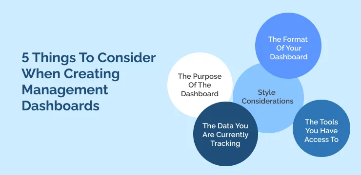
- The Purpose Of The Dashboard
The best dashboards are always purpose-driven. This means that they work best when they measure specific things for key users. For example, a project dashboard that has been organized to function for finance teams will look a lot different from an operations-focused project dashboard.
The most important purpose-driven project management dashboard aspects are:
- The target user of the dashboard
- The purpose, intent, and goals of the dashboard, taking into account what the dashboard will be used for
- The Data You Are Currently Tracking
It’s no surprise that project dashboards depend on the data that they are tracking and making use of. But, it’s important to remember that not all data is made equal or useful for that matter.
The best way to organize, and maintain useful data is by cataloging all of your data sources. Ask yourself what data you are currently tracking across your systems and why? What format is the data in and is it feasible to instantly plug it into your project dashboard?
The next step is to make a comprehensive list of your KPIs, metrics, and SMART goals that are specific to the requirements of your dashboard. Here, you can also include any other KPIs or objectives that are essential to other parts of your business.
- The Format Of Your Dashboard
Choosing the correct dashboard format can be achieved by answering the following questions:
- Who are the prime users that will access your dashboard and what are their top priorities and requirements?
- How often will these prime users be accessing the dashboard?
- Where and how will they be accessing the dashboard?
If you can easily answer the above questions, you’ll have a much easier time identifying justifiable use cases and will be able to get the most out of your project dashboard.
For example, if your dashboard is only accessed once or twice per month, then it can be in the form of a static report. Whereas if it’s accessed on a daily basis, a shared URL is probably the best way to go.
- Style Considerations
While the format of your project management dashboard is important, a lot of users tend to forget about the associated style and user interface (UI) aspects. This process needs to be approached with care and you really need to put yourself in the shoes of the target users to achieve the best results.
Ask yourself the following questions when considering the style and user experience (UX) of your dashboard:
- What level of complexity do core users expect in graph management?
- What kind of learning style applies to individual users?
- What is the level of technical know-how of your core users?
Its also important to explore different colors, themes, and variations that best suit your workforce. If target users prefer a certain aesthetic in order to work harmoniously, go with it. Remember to make sure that your dashboards aren’t convoluted and are as easy to read as possible.
- The Tools You Have Access To
The final consideration is whether the tools you are presenting in the finalized version of your dashboard are beneficial. For example, Excel is an excellent tool and the default resource for creating and monitoring most kinds of statistics. But creating dynamic dashboards in Excel is no simple feat and requires a decent amount of technical knowledge.
You might want to think about utilizing project management systems to create detailed, extensive dashboards from existing data if your team doesn’t have the required technical expertise or know-how to create them in Excel.
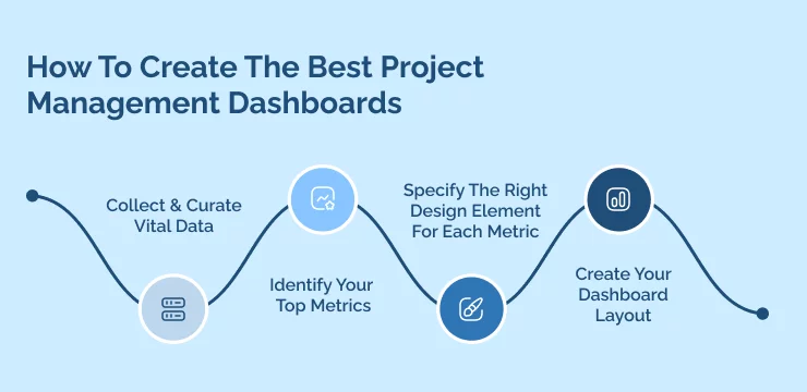
How To Create The Best Project Management Dashboards
The thing with project dashboards is that there is no clear-cut path to creating one. It all depends on the ways in which you collect your data and the way that it is stored.
That being said, there are a few best practices that apply to the overwhelming majority of project dashboards, regardless of the tools that you use or have access to:
Collect & Curate Vital Data
The best way to start building your project management dashboard is to identify and catalog all of your vital data sources. For each different source, you need to determine what format best suits data exportation. CSV is the best and most common format to use because it has ingrained functionality with both Excel and Google Sheets.
Start off by making a comprehensive list of all of your data sources and identifying their formats. It should look something akin to this:
- web traffic data – CSV format
- Financial data – CSV & PDF formats
- User data – SQL database
Most good dashboards enable you to use and run data in multiple different formats. If for whatever reason you aren’t able to do this, you need to figure out a way to quickly convert your data and make it compatible with your dashboard.
Identify Your Top Metrics
Each of your different data sources needs to have identifiable metrics attached and be updated frequently. This is a crucial step that enables you to figure out whether to utilize a static dashboard or a dynamic one.
For example, financial data related to specific projects isn’t inclined to change on a daily basis. However, the task list can change frequently and look very different each day or time that it is accessed.
Specify The Right Design Element For Each Metric
Once you have successfully identified the core metrics mentioned above, the next step is to choose the perfect graphical interface, in order to get the most out of your employees. This step wholly depends on your chosen end-users as well as the format of the metrics themselves.
For example, a to-do list that enhances cross-departmental collaboration is best represented in a list format. Whereas if you want to identify productivity over a certain time period, a graphical line graph is probably best.
Its also important to capture a key design element for each metric you are trying to achieve. This can be represented as a first name, task name and profile picture in your to-do list, which enhances organization.
Create Your Dashboard Layout
The best dashboard examples include comprehensive layouts that enable you to effortlessly organize your data.
We have identified the following methods that you should follow for the best dashboard layout:
- Elements that are bigger in size capture the eye and draw more attention. This means putting your most important KPIs as the largest elements within your dashboard.
- People read from left to right and from top to bottom. This means that your most critical metrics should be in the top left corner and the least important should be placed in the bottom right hand corner.
- Use colors that are standard, such as red for losses and green for profits to help guide users and make them more comfortable.
Management Dashboards & Key Performance Indicators
Dashboard software can be utilized to filter out unwanted data and information to make sure that core KPIs are achieved and relevant to their intended audience. Hundreds of different KPIs can be viewed online and some are listed by industry vertical, while others function horizontally.
This means that while it might be tempting to take the easy route, you should try and make sure that your KPIs are beneficial to your business over the long term. We’ve developed a list of guidelines to make sure that your project dashboard KPIs are effective and relevant over a longer period of time:
- Make sure that KPIs are relevant and relate to the changing needs of your business
- Make your KPIs actionable and meaningful
- Your KPIs should be measured frequently and repeatedly
- Make sure that your KPIs are relevant to their intended audience
- Keep dashboards simple, easy to use, and ensure they reflect the needs of the end-user
- Provide content for the data you are using
- Regularly update, educate and communicate with your teams on the importance of KPIs
- Measure return on investment (ROI)
- Evaluate the scope of your deployment and see what can be enhanced and improved
WalkMe Team
WalkMe spearheaded the Digital Adoption Platform (DAP) for associations to use the maximum capacity of their advanced resources. Utilizing man-made consciousness, AI, and context-oriented direction, WalkMe adds a powerful UI layer to raise the computerized proficiency, everything being equal.


